Fixed, Fluid, Responsive, Adaptive? Which Technique is Right for You?
11 Jun 2014, Posted by in TechnologiesNowadays designing websites and web apps requires more planning than ever before. New techniques and delivery devices can sometimes raise confusing questions. So where do you begin?
Of course, as always, everything starts with understanding your business. Before you push the first pixel you need to understand your audience, what problem your product or service solves, what the value is to the target user, and what it will take to get there both financially and logistically.
Once your business objectives and resources are clearly defined, you are ready to move on the actual design of the product. To do this you would typically call your creative director, art director, and /or lead designer (depending on how big your organization is) to share your ideas re the business or issue you want to address. Then you may be asked something like, “Do you want the site to be responsive?” To which you probably say, “What?” Or, even more perplexing, you are asked “Should we make the site responsive or adaptive?” At this point, your head may start to spin Linda Blair’s in the exorcist movie (to cite an old flick). As if that wasn’t enough confusion, your staff may then offer additional options like fixed and fluid.
Of course, as always, everything starts with understanding your business.
So what’s up with all these new terms? Fixed, fluid, responsive, adaptive? Let me try to define these for you.
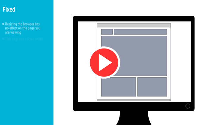
Fixed—the best way to explain this kind of design is that this is the traditional way of developing a website. This type of page does not change shape or re-arrange content based on the device that you are using to view them. Basically, a fixed site looks the same on a computer or a smart phone. Of course, it will look tiny on a phone screen and users will need to zoom in to be able to read anything.
Fluid—this kind of site adjusts based on percentages for width, making the columns relative to each other. This allows the site to scale up or down based on the size of the browser in which it is been displayed
Responsive—this type of design is built on a fluid grid. Additionally media queries are added to be able to scale and re-arrange the content as needed based on the size of the browser window or device in which it is displayed. Responsive sites re-use the same content in all devices.
Adaptive—these sites are not built on a fluid grid, although this is not a hard rule. They also use media queries, but they also rely on device detection to serve the correct version of the site or web app. When you build an adaptive site you usually create several versions of the site. At a minimal you create a general version to be used in computers, a table size for 7 to 10 inch displays, and a phone version for the smaller screens.
If you are building a new site or web app, in most cases you should consider a responsive and adaptive approach. Many factors are to be considered in addition to the three main considerations listed at the beginning of this post. Time to market, budget, and usability are key factors.
There are many books and websites that can give you a lot more information. If you want to learn about responsive options you can check out http://getbootstrap.com/. There are also several video on the web you can watch.
Just in case you are still confused, I have created a little animation to illustrate the difference between the four design approaches I have addressed in this post. Hope you find this helpful and as always thank you for reading my blog


